
An Aesthetic Appeal
A few words about 'Far from Heaven'

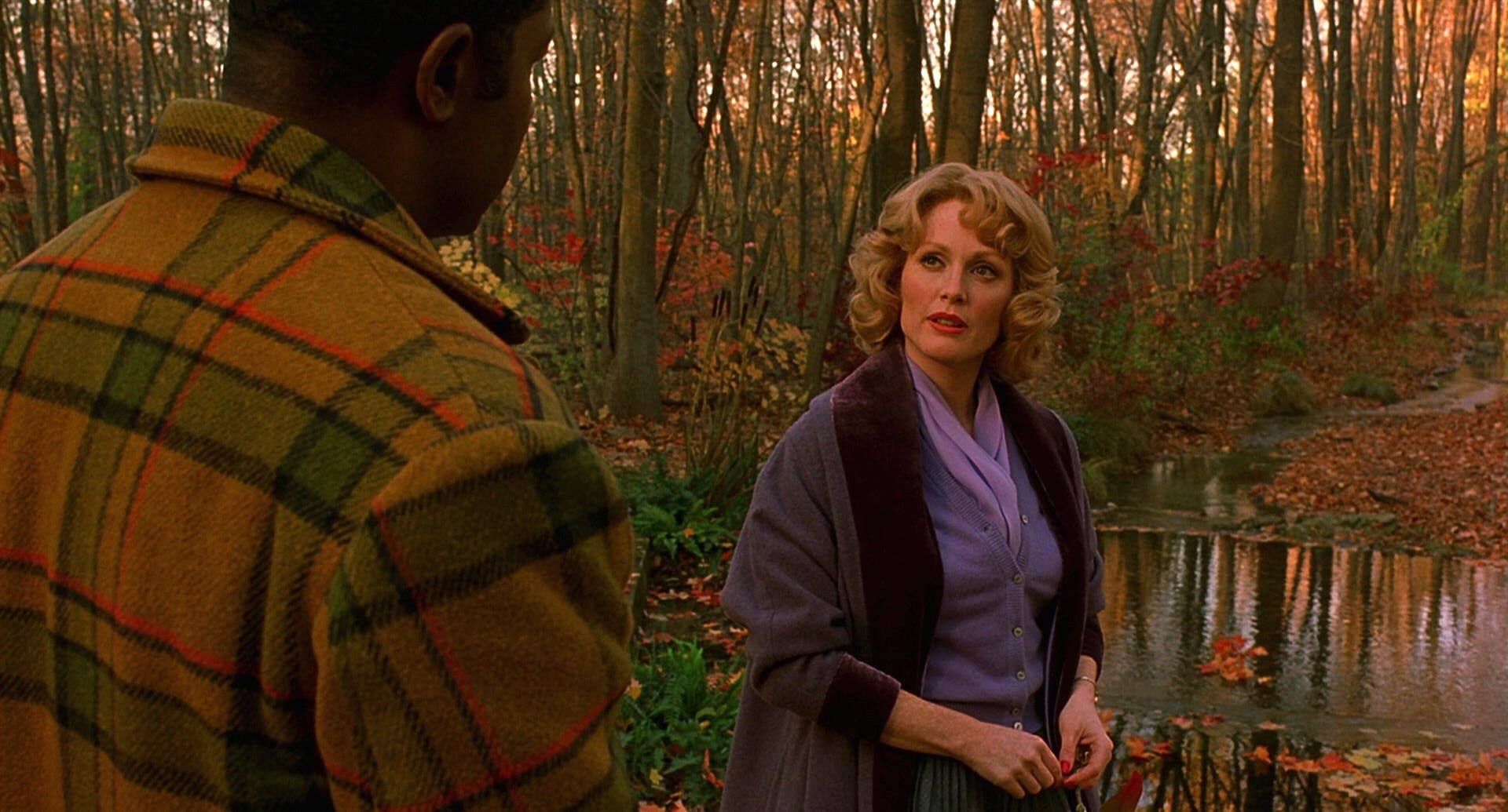
Yesterday I went to a matinée of Far From Heaven at my local cheapo theatre. Every week, they rotate in a number of classic and anime titles, each screening multiple times a week on their tiny screens with way-too-visible speaker holes, for the low, low price of $5. Other films this week: Ghost in the Shell, Showgirls, and Paprika. It had been many years since I last saw Far from Heaven, Todd Haynes’s ravishing homage to the great Douglas Sirk. I remembered its autumnal beauty, but memory hardly does it justice. With Ed Lachmann’s cinematography, Mark Friedberg’s production design, Sandy Powell’s costumes, tied together by Elmer Bernstein’s lush score, the film evokes late-’50s New England through post-war Technicolor nostalgia. The tragic realities undergirding such beautiful surfaces are the film’s subject, but the surfaces are its mode of communication, in the true spirit of Sirkian melodrama.
I’ve written before about what movies look like now.

More than once.

And in other venues, too. This is not my conversation alone. Almost every day, I’ll see someone on social media posting about modern movies looking like sludge, or how even your average direct-to-video garbage from the ‘90s looks better than 90% of stuff now because it was shot on film. I have posted those things. Those things are basically true, if somewhat exaggerated (it’s not like the ‘90s garbage actually looks good, just more… organic.) Rewatching Far from Heaven, I found myself questioning my position.
This is a movie overtly paying tribute to an older style of movie. It’s artifice, meant to capture an image of a certain time using aesthetic trends of that period. It would be absurd to demand all modern movies look like Far From Heaven. Even Far from Heaven doesn’t look like Far from Heaven in key moments. In the movie’s sharpest scenes of realism, those moments that are most modern compared to a film from the ‘50s, it drops the stylization to a degree. The movie’s sumptuous colours are almost fully drained in its final, bittersweet shots. This interplay, this aesthetic meta-commentary, comprises the film’s spirit. Not every movie has the same spirit, nor should they. A modern film reflecting modern aesthetics is normal, and important.
But what if modern aesthetics suck? Minimalism has become a parody of itself, sold as sleek to the tasteless, infecting our living environments with unfeeling blandness in keeping with its hyper-consumerist ideals. The recent revival of Mid-Century Modern interior design is only more nostalgia, one of many nostalgic aesthetic trends that have piled on each other in increasingly indistinct layers. A mush of “stylish” stylelessness has overwhelmed us. That is the true aesthetic of this era: mush.
Questions of “why?” and “how?” are too much for me to begin approaching, though I’m sure “capitalism” would come up. Still, I wonder what we can do in a culturally flattened environment to establish new looks, new styles, which reflect the sensibilities of the time, but with more universal coherence, relatability, and most of all, aspiration. The trick of Far from Heaven is that its Norman Rockwell-esque visual tones are a costume, a mask. Perhaps a lie. But Haynes also understands that Sirk’s similarly fanciful style was an act of implicit commentary. The Hayes Code might have prevented Sirk addressing certain issues directly, but they exist under the surface all the same. The look of his films, in all their splendid colour, is itself a deliberate artifice. Technicolor as opera. A departure from reality that communicates reality’s deep, complicated heart.
All of that is to say, the aesthetic in Sirk’s films was a choice, and a bold one dismissed by many critics at the time. Yet to imagine America in the ‘50s now is, basically, to imagine Sirk. He picked up on the trends of the time and accentuated them to an extreme, enshrining their beauty inherent. What are artists and filmmakers meant to pick up on today? Rehashed images of ‘50s pop art, or ‘70s era grit, or ‘90s grunge? Are we doomed to accept art whose conception of the contemporary is as bland and ugly as our reality? All that corporatized glass and steel and so much grey?
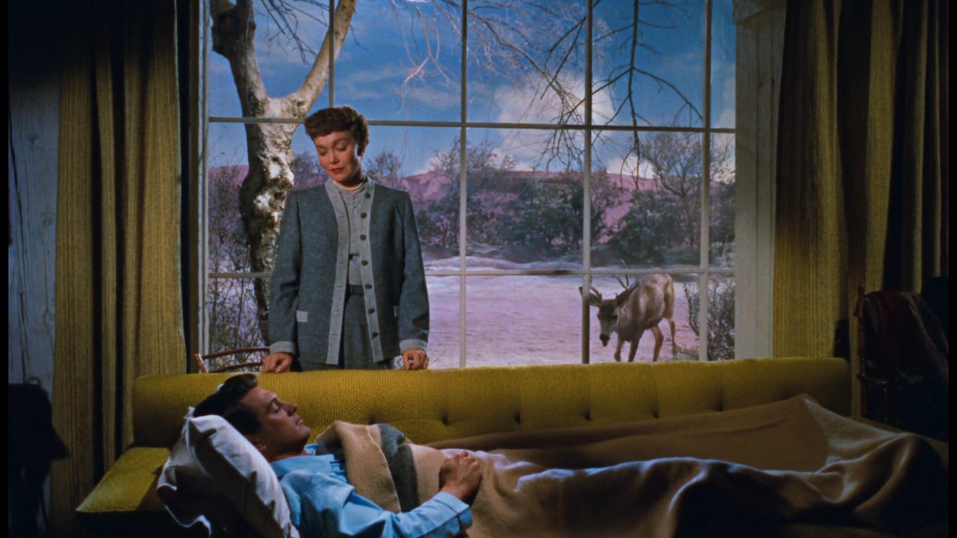
Recently, I’ve been watching the original Sean Connery Bond films, and in the middle of Dr. No, it occurred to me that the styles present in the film, which so dominate the era, in fact helped to define the era as it was happening. British and American cultures particularly found aspiration and inspiration in the Bond series’ colourfully designed escapades. It was a generative relationship, and other films and works of art did the same, indulging styles of the period and solidifying them.
Looking at art today, I question what it is we’re solidifying. So many new films set in Vrbo-ass mansions in ill-defined locales, looking “good,” but happy to concede to our aesthetic race to the bottom. I felt this even watching Eddington recently, a film shot very well by a true master, Darius Khondji. Yet it has an airlessness about it, common in all of Aster’s work, whose greatest visual accomplishment so far has been the memorably bright Midsommar, which itself still often feels clean to a fault. If corporatized sleekness is the day’s overwhelming aesthetic, where are the artists transforming that style into something more human and expressive? It sometimes feels like there is no culture left—and no society, either—but this is a choice we make, and we can choose instead a different form of culture-making. We should prize art that is unsatisfied merely looking good, or even great. A lot of things “look good,” but few things that look good actually express the dreams of the moment, or the nightmares for that matter. There is no colour left in our world, not unlike the ending of Far from Heaven. But the world can change.
Further writings to pique your interest:


